What I actually did: Run a few workshops around the personas, design the User journey, Deliver Wireframes, Conduct a Low fidelity usability Survey, and finally deliver high fidelity visuals to the Developers.
What will you read here: Understand the way I faced each phase, read about the rationale behind the designs, and access one of the usability reports I delivered.
What you won’t read: You won’t find anything about major iterations (For personal reasons I had to move to Greece right after the launch of the campaign) You won’t access personas or other data that are considered sensitive information of the Tearfund creative team.
TEARFUND UK
Challenge: Designing a User-centered Fundraising Campaign

Short-term Campaign Design
Role: Ui/Ux Design & Ux Research
Dates: November 2016 - December 2016

Direction
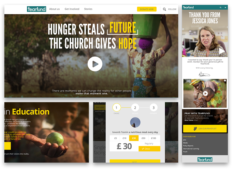
Participating in the main brainstorming session, run by the Project manager, all the creatives chipped in and the final outcome on the messaging was:“Hunger Steals, Ghuch gives”. Right there I was very happy to add a few touches on the main concept of the campaign:
(We could free users to choose themselves what they want to fund.) e.g. Hunger Steals: ??????, (then the field gets filled): Church Gives Education.
Something that goes like that: “Now we have a way to talk to you, about what matters to you.
Let’s show you how we enable the church to give Education.”
Moreover, we needed to make sure the fieldwork teams would be ok with that, and if they could actually deliver such services and bring Content manager on board, asking our Lead Copywriter visiting Malawi, and focus on stories to do with Education, Investment, Hope.

Personas Research
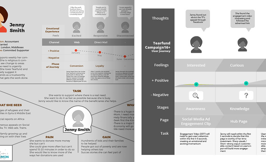
My role was to revisit our user personas and facilitate some of the empathy-mapping workshops. With the help of other people from the Marketing and Customers Service team, we came up with some useful answers to how each user feels, hears, wants, and which are the positive and negative feelings during their interaction with the banner ad > page > donation and “thank you” process.
The most important was the feedback from the Customer Service, as they were the ones dealing with the clients daily.

Information Architecture / Wireframes
I usually like to make an imaginary discussion with the user:
For example, you clicked on: “Future”, (1) here is what happens in the world, (building awareness),
(2) here is what we are doing (communicating what’s special about us). (3) Now would you like to help us deliver more so and so? (e.g. Education? or Potential?)
Having articulated it right, my question was, how can we have the same discussion for all 4 fundraising personas.
With the results of workshops owned by Tearfund UK, some information may be limited and not in great depth.

Softlaunch
(As I look back I notice how influenced I was from MadMax, Fury Road 😛 ) Visuals would be heavily tinted and sometimes a bit over the top.
Still, we loved the visuals that started arriving from Malawi, and I focused on communicating the dust and the dirt of it all. Because Copy wasn’t ready yet, I worked with general titles of stories that were provided to us, giving the framework to the Copywriters. Personally I love that approach instead of trying to fit in copy that is way too much and no one will read.

Usability Tests
After the first idea was there, we moved on to rapidly testing it with users that would fit our targeted audience. Their insight was pretty useful helping us a) sharpen & shorten the copy a bit b) simplify the giving handles (how you choose which amount to donate).
-During our tests and due to the limited time, we hadn’t finalized the version on the top interaction.-

Donation Journey Tweaked / Thank you Process
Personally I find that donating money is usually a bit dull as a process. That kept me trying to find ways, to make the process friendlier and more exciting. After some brainstorming with colleagues from the Marketing department, I came up with an interesting way, where, right when people have finalized their donation, stuff from the organization that lead different departments, would thank in a “personal” fullscreen video message the donor, providing next steps e.g Newsletter etc.
We got some really positive feedback from the Customer Services, pointing out how positively surprised users were.
We realized that this addition really helped users ease off while it also created some instant gratification.

